About me

Hi! I'm Rayyan, a student student studying Information Systems and Computer Science at the University of Houston passionate about UX Design. Since early on, I've been a tech enthusiast and creative at heart. My drive for creative expression began with drawing, transitioning to photography and design.

UX perfectly blends my interests in tech and design. I've enrolled in UX courses to enhance my skills and bring my ideas to life. With a foundation in design thinking, I am experienced with tools like Figma, InDesign, Photoshop, Lightroom, Framer, HTML, JavaScript, CSS, C++, Python, and ASM.

Experience

Jun 2024 — Aug 2024

American EMR

Product Design Intern

Designed mobile application for a world-class patient profile system.

2022 — 2022

Investate Holdings

Website Developer

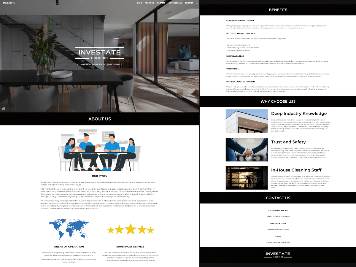
Designed and developed a B2B-facing portfolio website.

Dec 2022

Life Span Euro Med Spa

Designer Contract

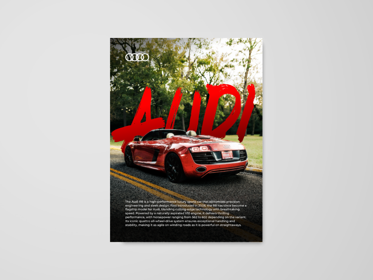
Designed promotional banners for print while maintaining visual brand identity.

Aug 2018 - Dec 2022

Executive Concrete Solutions

Website Designer Contract

Consulted with client to identify business requirements and designed features like a photo gallery, contact form, and about page with multiple revisions.

Aug 2018 - Dec 2022

Klein Cain High School

Photographer & Designer

Designed sections in high school yearbook for sports, dance, arts, and school culture using Adobe InDesign, Photoshop, and Lightroom.

Aug 2018

Scholastic Silver Key Award

Artist

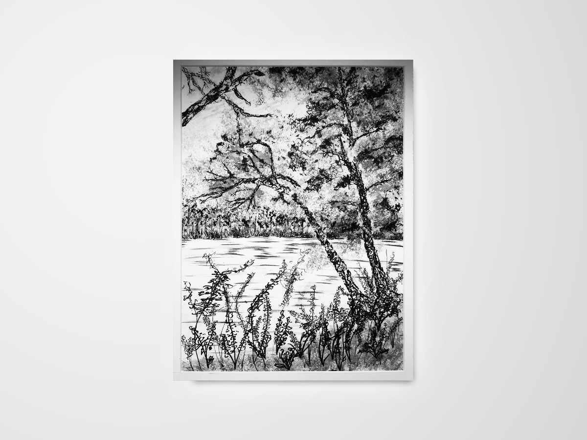
Won the Scholastic Silver Key Award for a mixed-media art piece using India Ink, plastic, sponge, and other unique materials.


Clients

  • Investate Holdings logo
  • Life Span Euro Med Spa logo
  • Executive Concrete Solutions logo

American EMR

Figma Prototype

Context

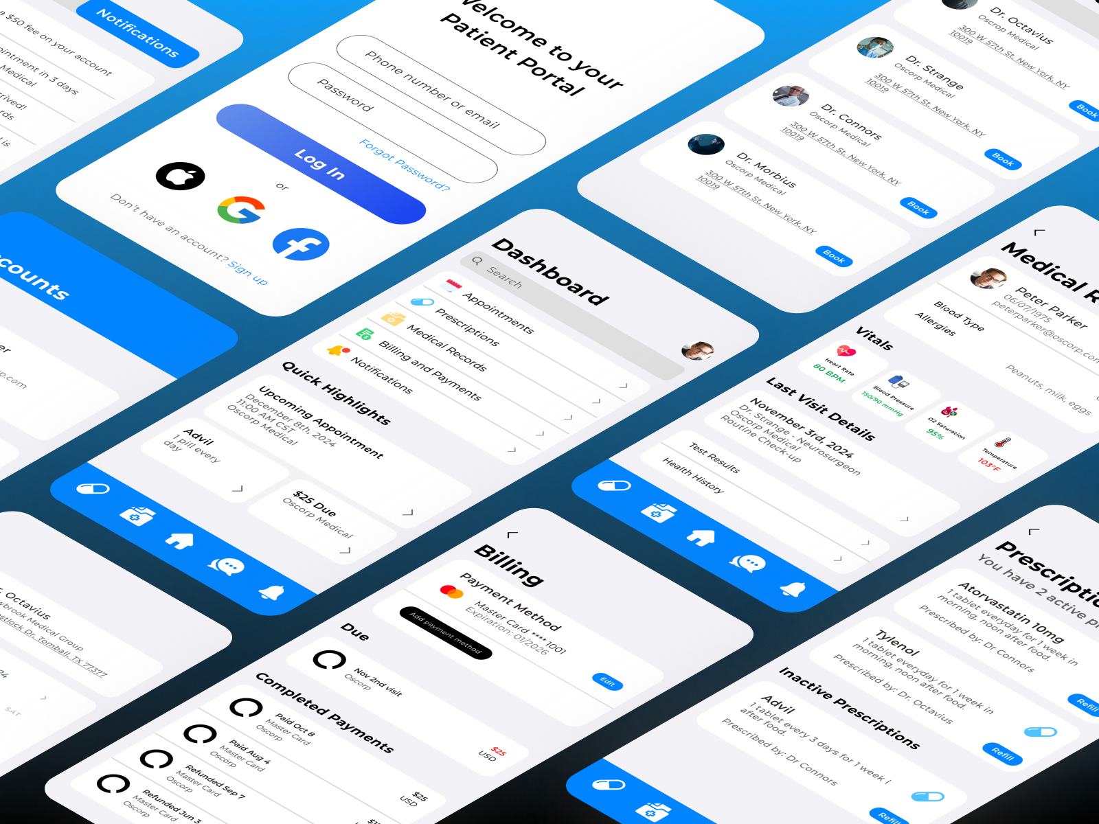
  • American EMR is a software solution that addresses common challenges in current electronic medical records (EMR) softwares such as: outdated designs, limited features, and poor usability. This project aimed to create an intuitive, all-in-one patient app to improve practice management and patient care.

Overview

  • Timeline: 1 week
  • My Role: UX/UI Designer
  • Tools Used: Figma
  • Objective: Design an easy to navigate patient portal app.

Problem Statement

  • Patients struggle with complex healthcare applications that lack an all-in-one solution for essential features such as appointment scheduling, medication reminders, payment processing, and medical records access. This leads to frustration and inefficiency in managing their healthcare, highlighting the need for an intuitive patient portal that simplifies and centralizes these features.
Goals
  • Simplify navigation
  • Enhance accessiblity for all users.
  • Create an intuitive, user friendly patient app.

Design Process

1. Research & Discovery
  • Reviewed user data provided by American EMR and conducted patient interviews to uncover pain points like poor navigation and disjointed functionality.
  • Key Insight: Patients wanted a simple, easy to use app for fast access to critical information and essential features.
  • Visual Design

      Branding
    • Primary Color: Blue, chosen to evoke calmness, trust, and serenity, aligning with the app's healthcare focus.
    • Secondary Color: Black, used sparingly for contrast and emphasis.
    • Bankground & Cards: Light gray used for the background and white for cards, ensuring a clean and modern aesthetic.
    • Typrography: Montserrat, sans-serif font for selected for its readability and contemporary aesthetic.

    Prototyping and Testing

        1. Highlights Section
      • Quick Highlights Section
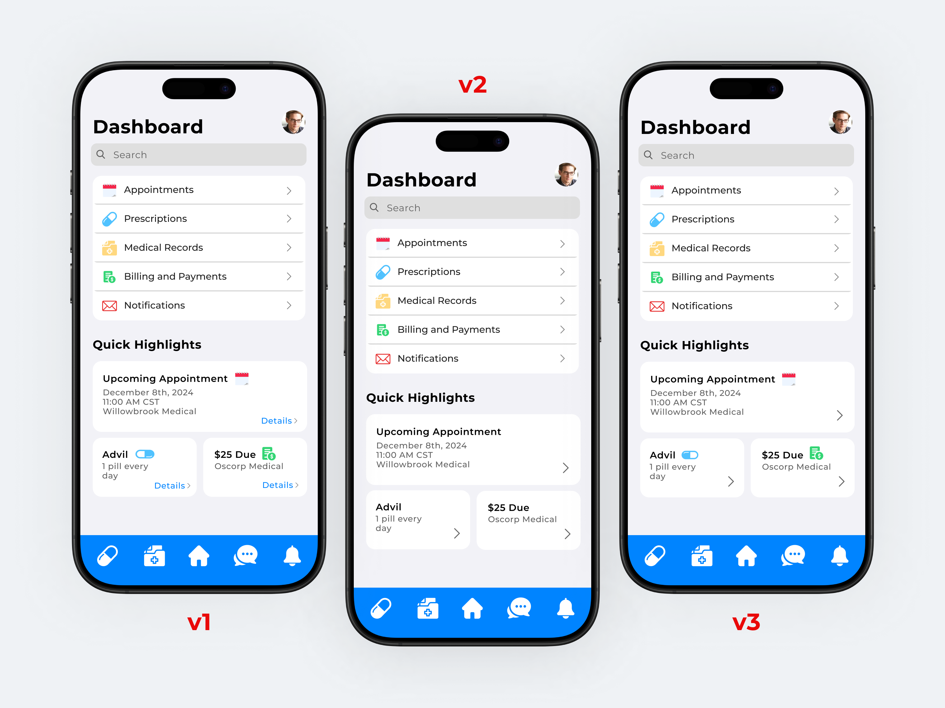
      • After completing the home dashboard, half of the screen was still unused space and I decided to add a Quick Highlights section. This feature displays key patient information, such as medication reminders, upcoming appointments, and missed payments, allowing users to easily view and access important details at a glance.
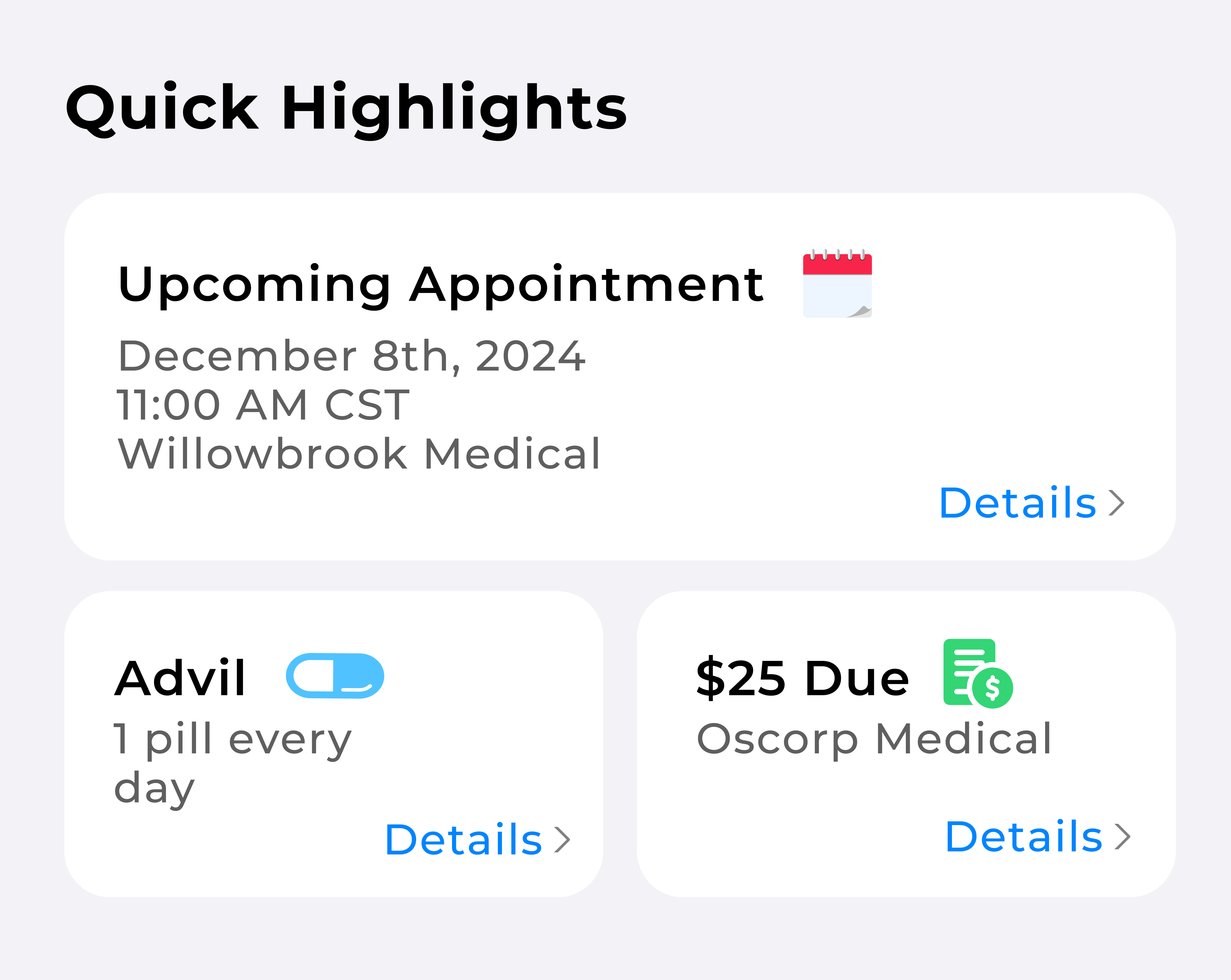
      • Quick Highlights Version 1
      • In the first iteration, I designed widget-style cards with black titles and icons for visual recognition. To maintain consistency with the dashboard, I integrated the arrows and added a "details" label, indicating that the cards were clickable for more information.
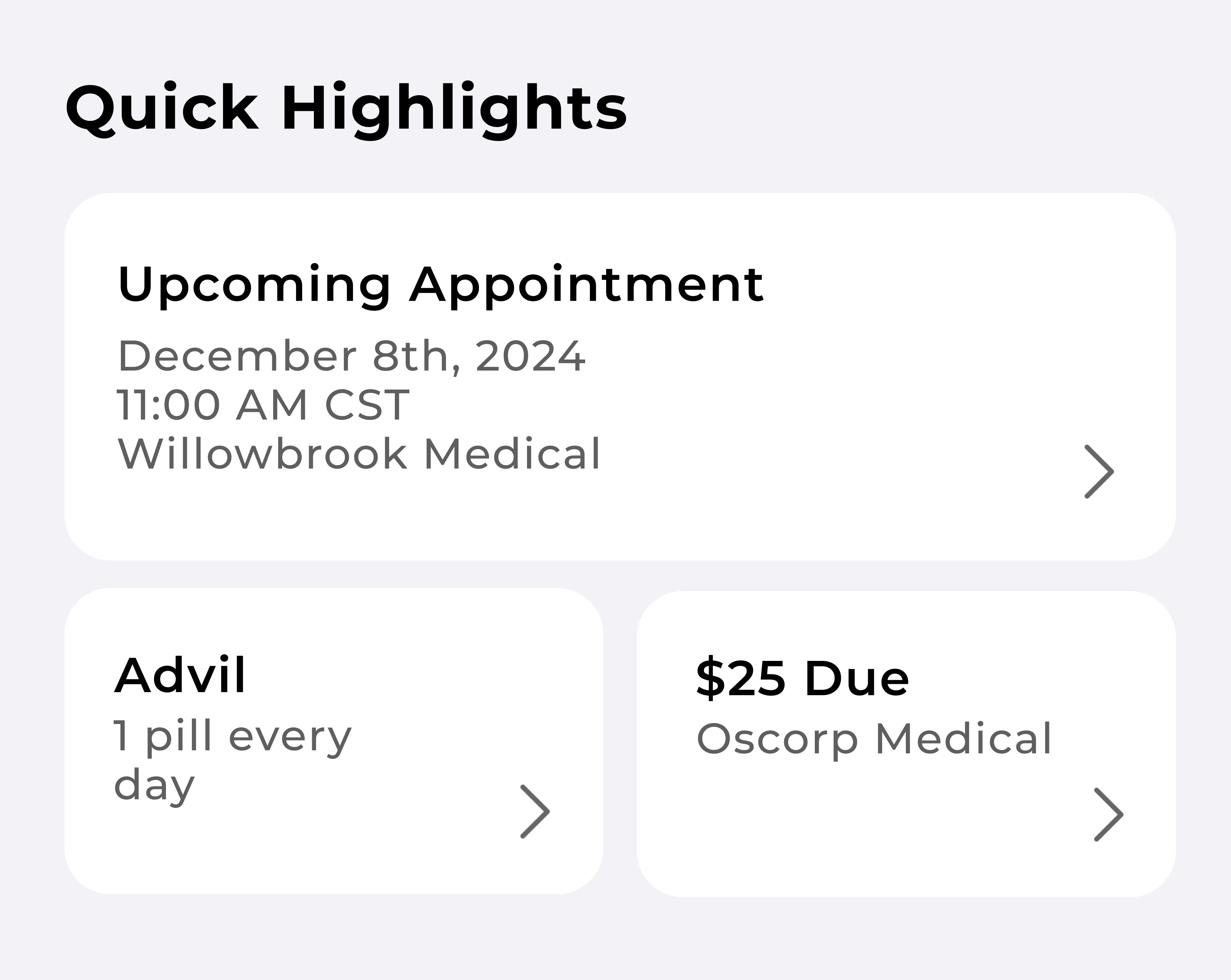
      • Quick Highlights Version 2
      • After reviewing the first version, user feedback indicated the cards was too cluttered. To simplify, I removed the icons and "details" text, as the arrows already indicated clickability. I kept only the arrows, increasing their size to maintain continuity with the dashboard and improve visibility. With this iteration I aimed to allow users to quickly access important information without distractions.
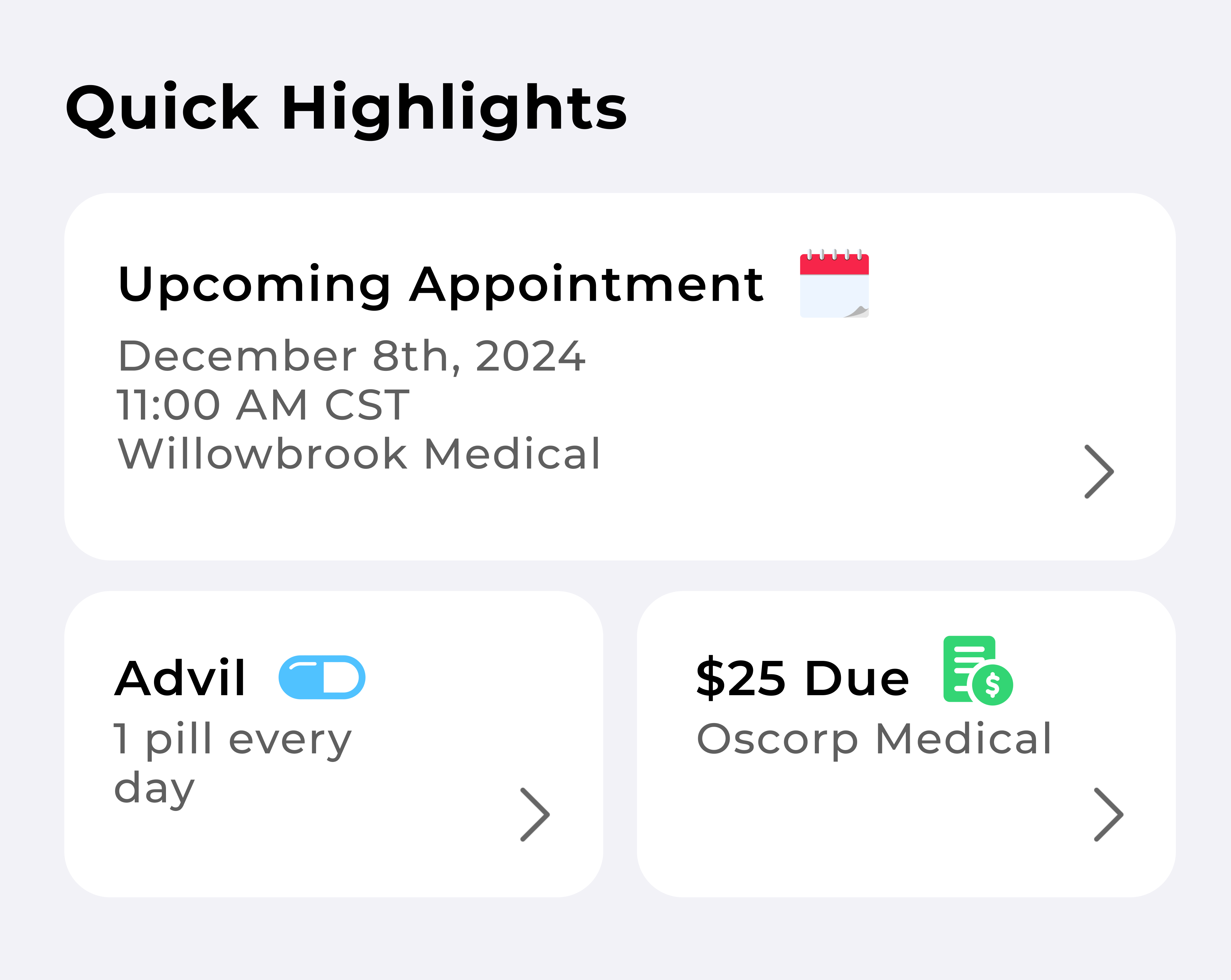
      • Quick Highlights Version 3
      • However, after re-evaluating version 2 made the cards indistinquishable at a glance, this was a problem since users should be able to quickly view this information. I reintroduced the icons to maintain the design continuity from the dashboard while excluding the "details" text and this helped balance the visual load.
      • 2. Back Arrow in pages
      • Back Arrow in Subpages
      • During user testing, I found that users struggled to navigate back to the previous page from the dashboard. I had designed thinking the home icon in the menu was sufficient but it wasn't intuitive. To address this pain point, I added back arrows at the top of each page, ensuring consistency with the dashboard’s arrow theme and providing users with a clear way return to the previous page.
      • 3. Sticky Menu
      • The early iteration limited the menu to three icons. However, through user testing I discovered patients wanted more options for seamless navigation for frequent access to important info.
      • On the final design I added Medical Records and Notifications to the menu, removed the text under the icons to reduce clutter, and opted for filled icons to enhance visibility.

    Figma Prototype

    • To further showcase the design's functionality and flow, I’ve embedded the interactive prototype from Figma.
    Highlights

    Login

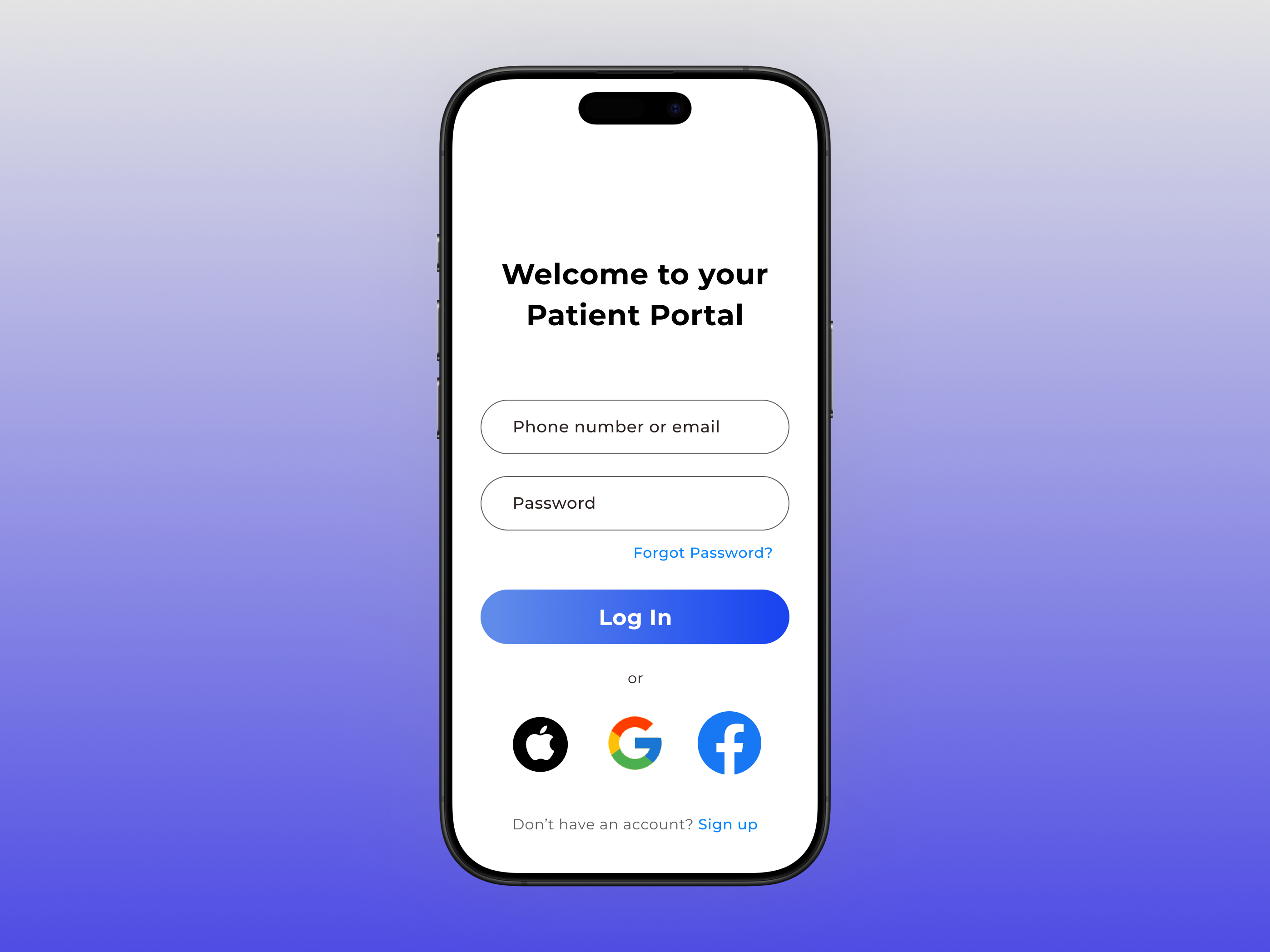
    Understanding that patients may not be tech saavy, I kept the design minimal to ensure accessiblility for all patients. With a prominent CTA button, carefully colored and sized text, I designed an easy and frictionless login experience.

    1. Login Page

    Dashboard

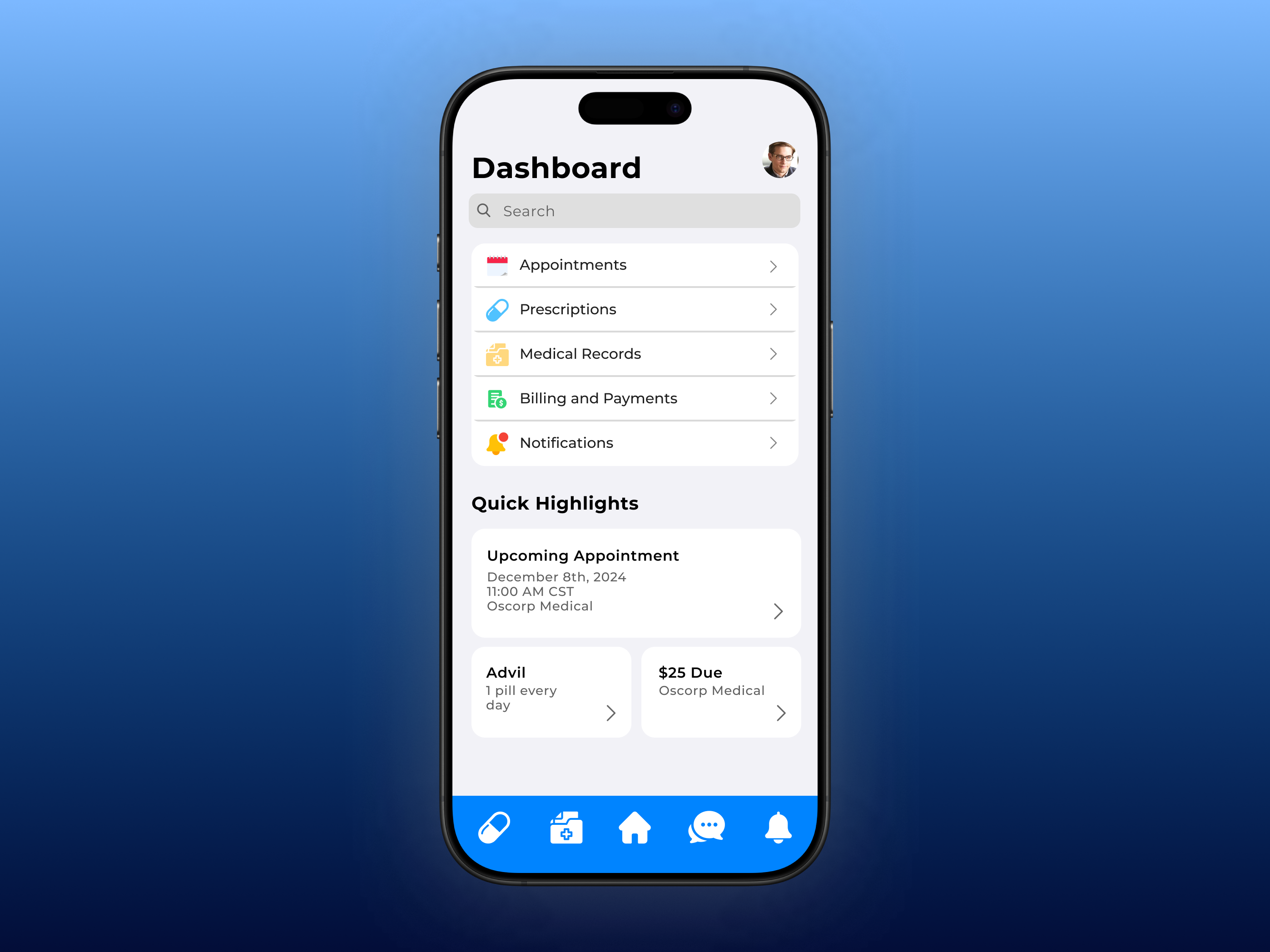
    Patients need an intuitive dashboard, so I choose a list layout with icons for easy identification. User feedback led to the addition of arrows to indicate clickable items, and a “highlights” section below displaying quick information like medication reminders and missed payments in a widget-style layout.

    2. Dashboard

    Appointments

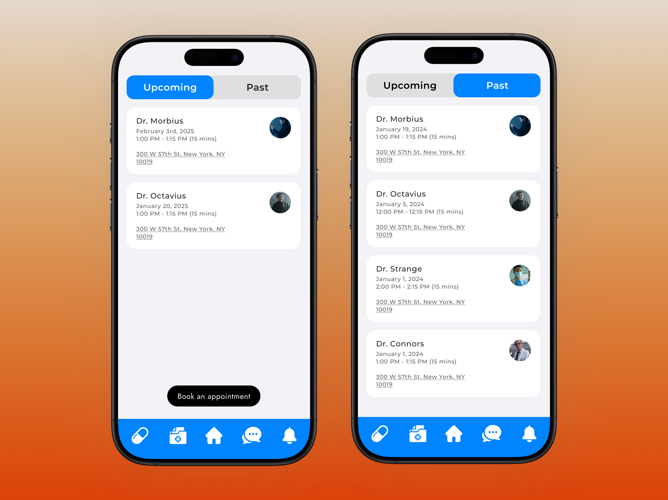
    This page features a toggle to switch between appointment types, with active and inactive states for easy identification. Underneath, each card displays details like doctor name, clinic, timing, and includes an underlined address link and a prominent button to book new appointments. This design enables users with quick and easy navigation to view and make changes to their appointment details.

    3. Appointments

    Bookings

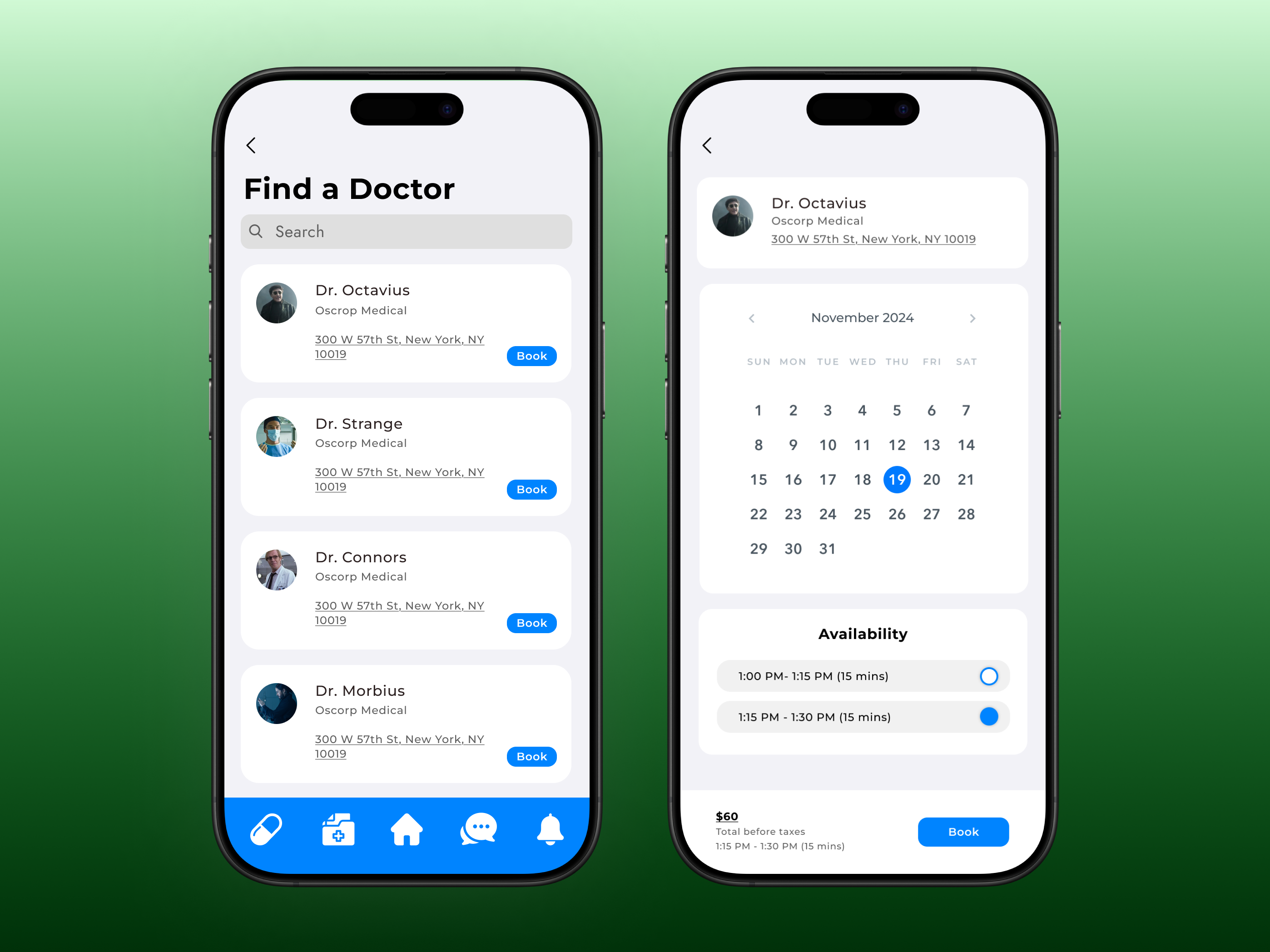
    Patients want an efficient way to browse doctors and book appointments. The bookings page lets them search and filter doctors or clinics, and find available providers with the prominent blue colored call to action “book” button.

    4. Bookings

    Prescriptions

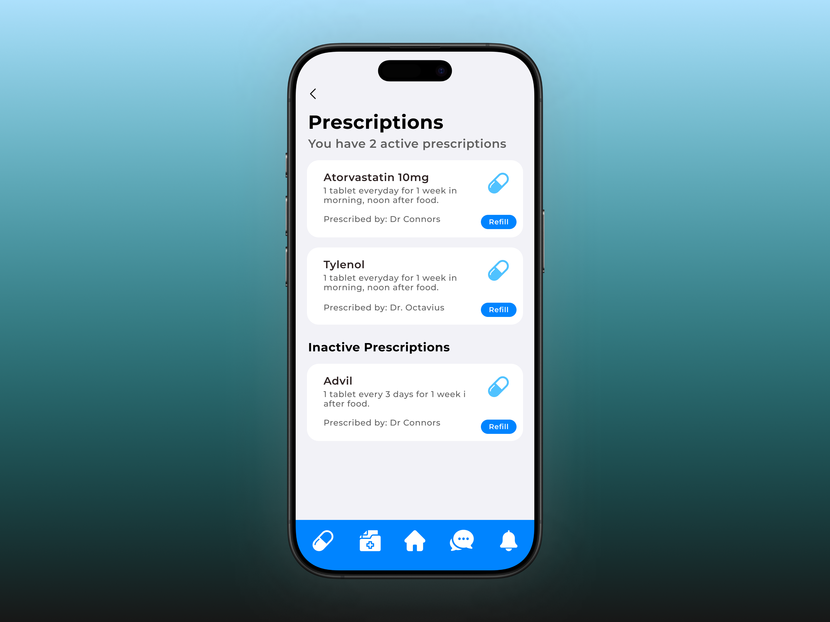
    Patients needed a simple solution to view active prescriptions and access refills. The secondary text under the header easily display the number of active prescriptions. I designed cards with prescription details (name, doctor notes, prescribing doctor). A blue refill CTA button provides easy access for users to manage their prescriptions.

    5. Prescriptions

    Medical Records

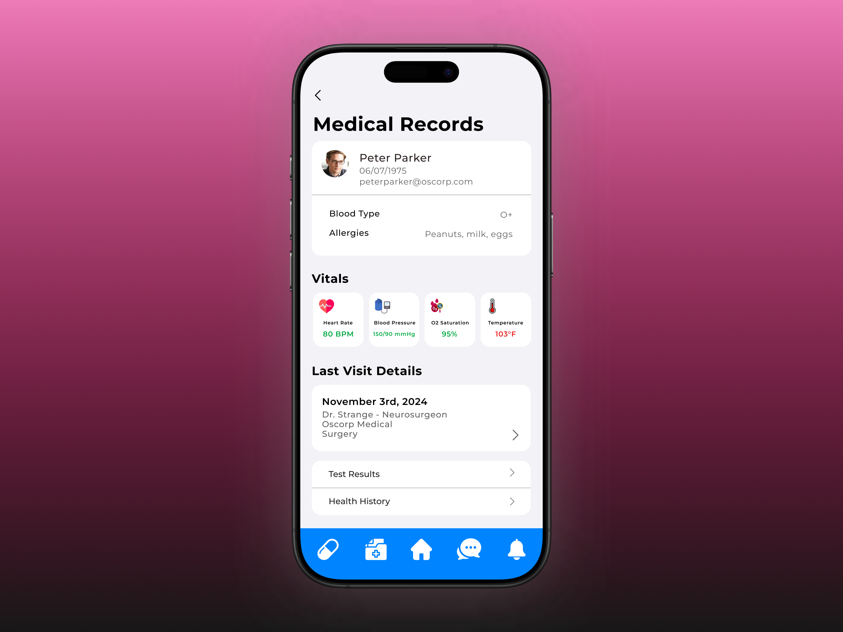
    Alternative patient apps often separate patient records like lab results, health history, etc, making them hard to access. Facing this problem myself, I designed a centralized Medical Records page that consolidates all medical information in one place. It includes a patient card, live vitals through smart device integration, card for previous visit details, and a menu list for other records. This design ensures users can easily view and manage their health information.

    6. Medical Records

    Billing

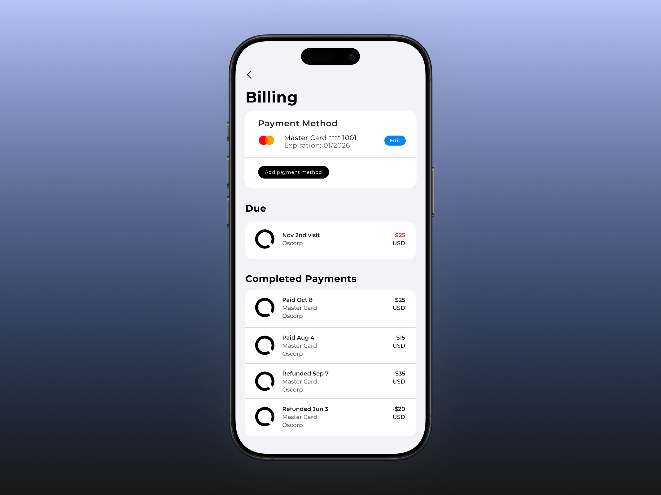
    The Billing page offers a clear, organized layout, allowing users to easily manage and view their billing information, past invoices, and missed payments.

    7. Billing

    Messages & Notifications

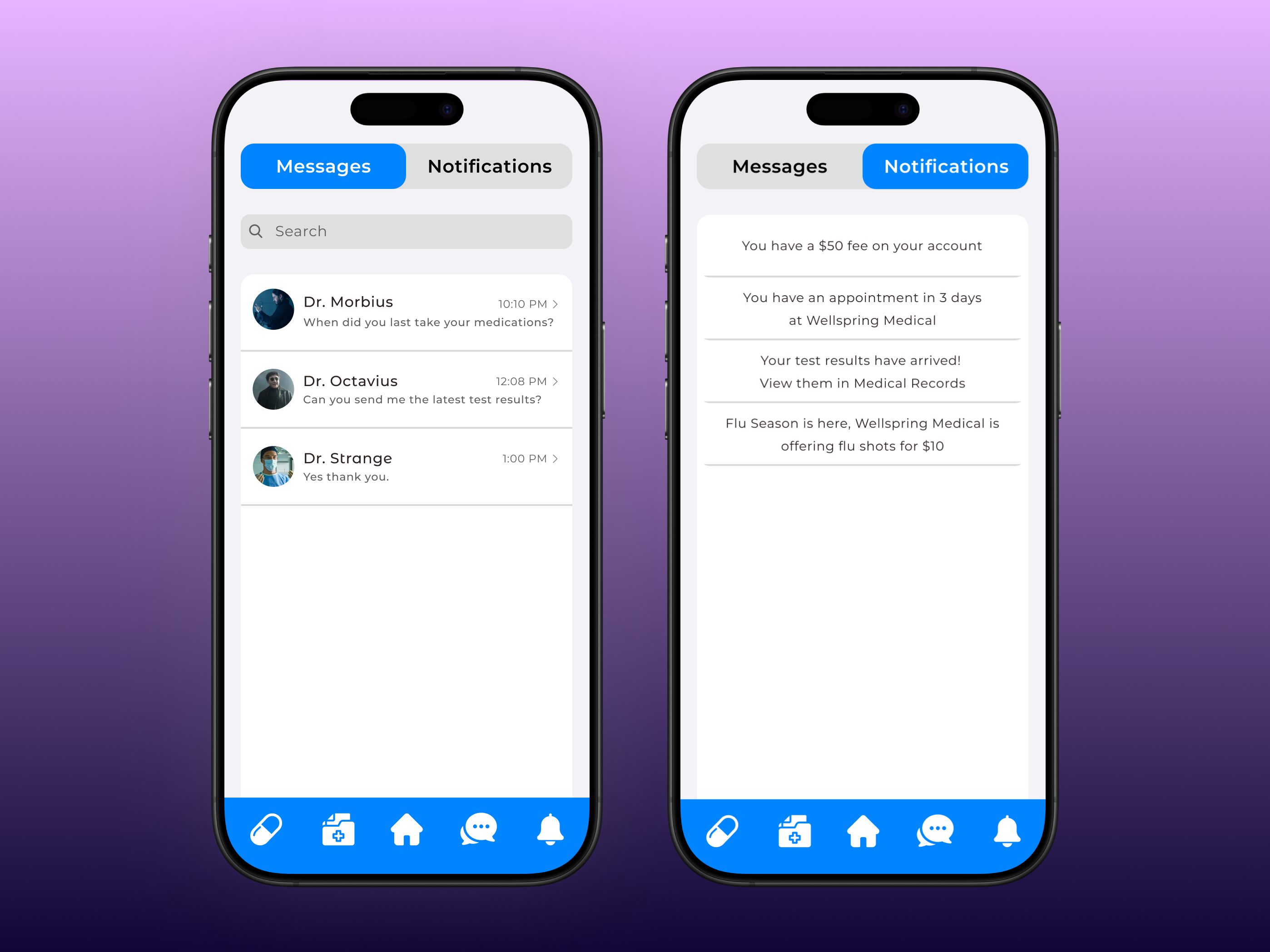
    This page incorporates the toggle bar from the appointments page for easy navigation between messages and notifications. A search bar allows users to quickly find specific messages, while the notifications section highlights important information for quick access, ensuring users stay informed without clutter.

    7. Messages & Notifications

    Reflection

      Challenges I Faced:
    • Exploring Figma’s tools was exciting for my first project. A key challenge was not setting up an asset library, which would have streamlined the process and ensured design consistency. Balancing user needs with stakeholder constraints was also challenging. For instance, the development team raised feasibility issues for the appointment booking feature due to complexity or time constraints. Similarly, my initial payment UI concept faced challenges involving insurance coverage intricacies. These experiences emphasized the importance of early stakeholder collaboration to align scope and feasibility, saving time and effort.
    • What I Learned:
    • I learned the importance of creating reusable design assets, such as components, variants, and instances, to streamline workflows and maintain consistency.
    • I recognized how critical domain knowledge is to creating practical and user-centered solutions.
    • This project reinforced the need to remain open to iteration and feedback, recognizing that good design is an ongoing process of refinement.
    • Next Steps:
    • Moving forward, I plan to adopt asset libraries from the start, refine typography systems early on, and deepen my domain knowledge for better-informed designs. I aim to embrace continuous improvement, staying flexible and open to feedback to create better user experiences.

    Investate Holdings

    See Website

    Context

    • Investate Holdings is a corporate housing company specializing in providing short-term accommodations for business travelers. The company manages a diverse portfolio of properties, including both owned and leased assets.
    • As a rapidly expanding organization, Investate Holdings is strategically expanding into new locations to meet the growing demand for short term rentals.

    Overview

    • Timeline: 3 days
    • My Role: UX/UI Designer
    • Tools Used: Figma, HTML, CSS
    • Objective: Design a responsive website to communicate Investate Holdings' services, build trust, and drive client inquiries.

    Problem Statement

    • Despite its rapid growth, Investate Holdings lacked a professional website to effectively pitch its business to clients and investors. This gap hindered its ability to establish trust, showcase services, and communicate its value proposition in a competitive market.
    Goals
    • Create a b2b-centric website that highlights Investate Holdings' services.
    • Build trust through a modern and professional design.
    • Ensure smooth, intuitive navigation to enhance the user experience.

    Design Process

    The Investate Holdings website was crafted using a systematic and user-focused design process to ensure both business goals and user needs were met effectively.

    1. Research & Discovery
  • I first gathered info on who Investate is seeking to target with this website. Asking what their biggest risks and drawbacks are with their building units. I came to find that a lot of units are vacant, and of the ones that are leased to tenants, there's no telling what the condition of the unit will be once they move out.
  • 2. User Personas
  • The target users are building owners who face difficulties with traditional tenants and are looking for more stable and predictable rental options. They value trust and reliability, making it essential to communicate these factors clearly on the website.
  • Ideation & Wireframing

      Information Architecture
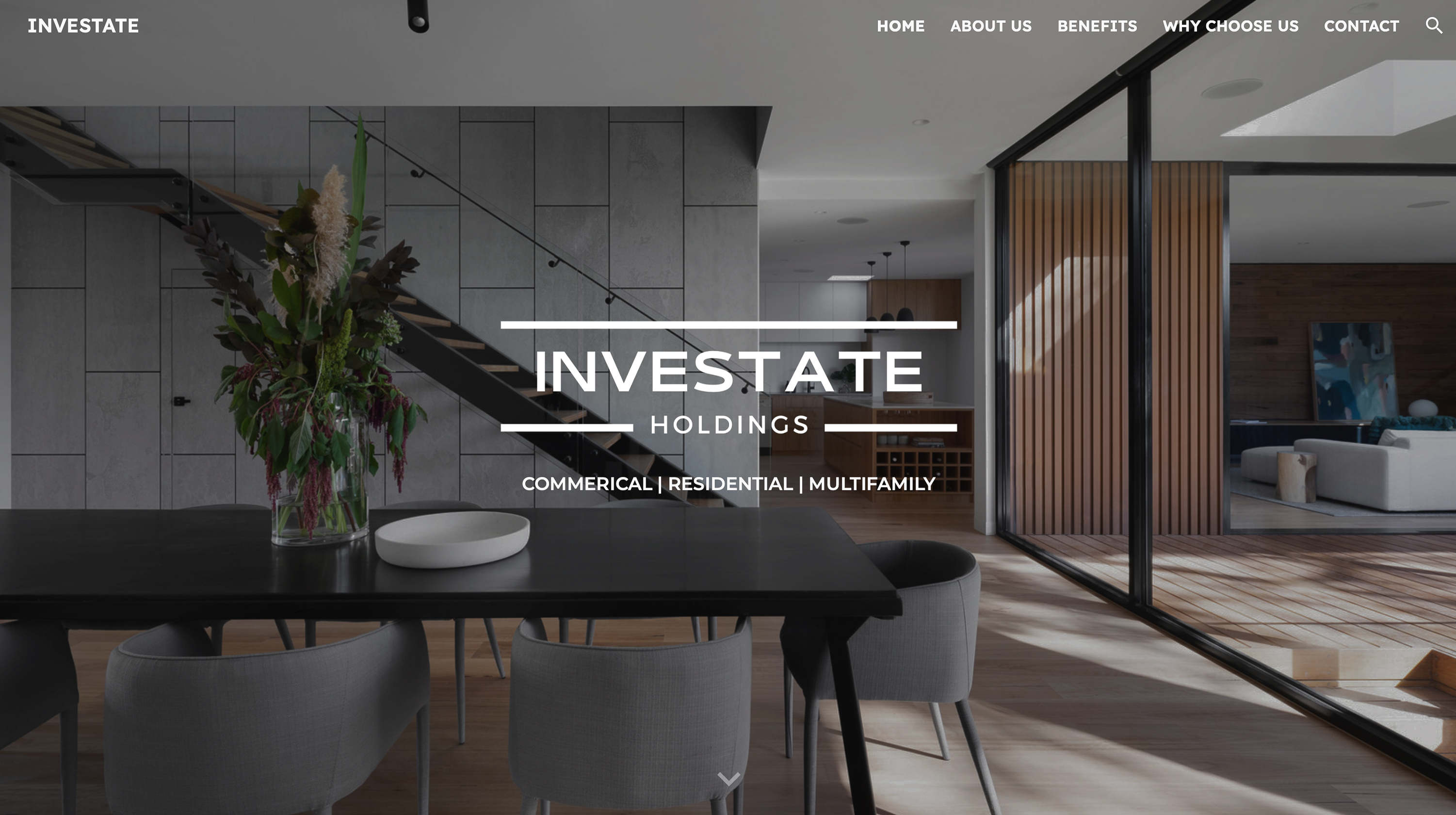
    • Structured the site with four key sections: Home, About Us, Why Choose Us, Contact.
    • Prioritized ease of navigation with a sticky menu, one-page scroll website, and CTAs.
    • Wireframing
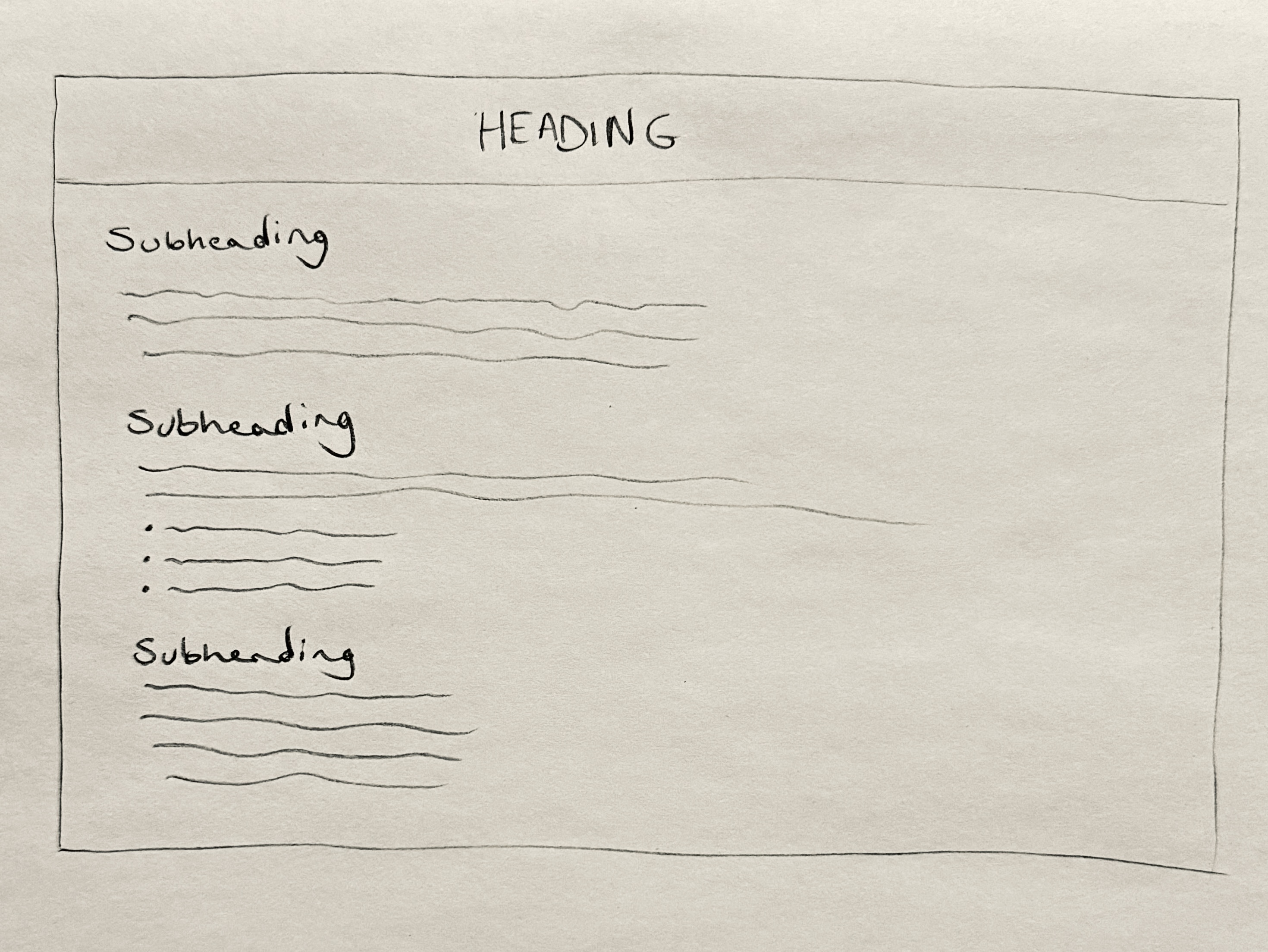
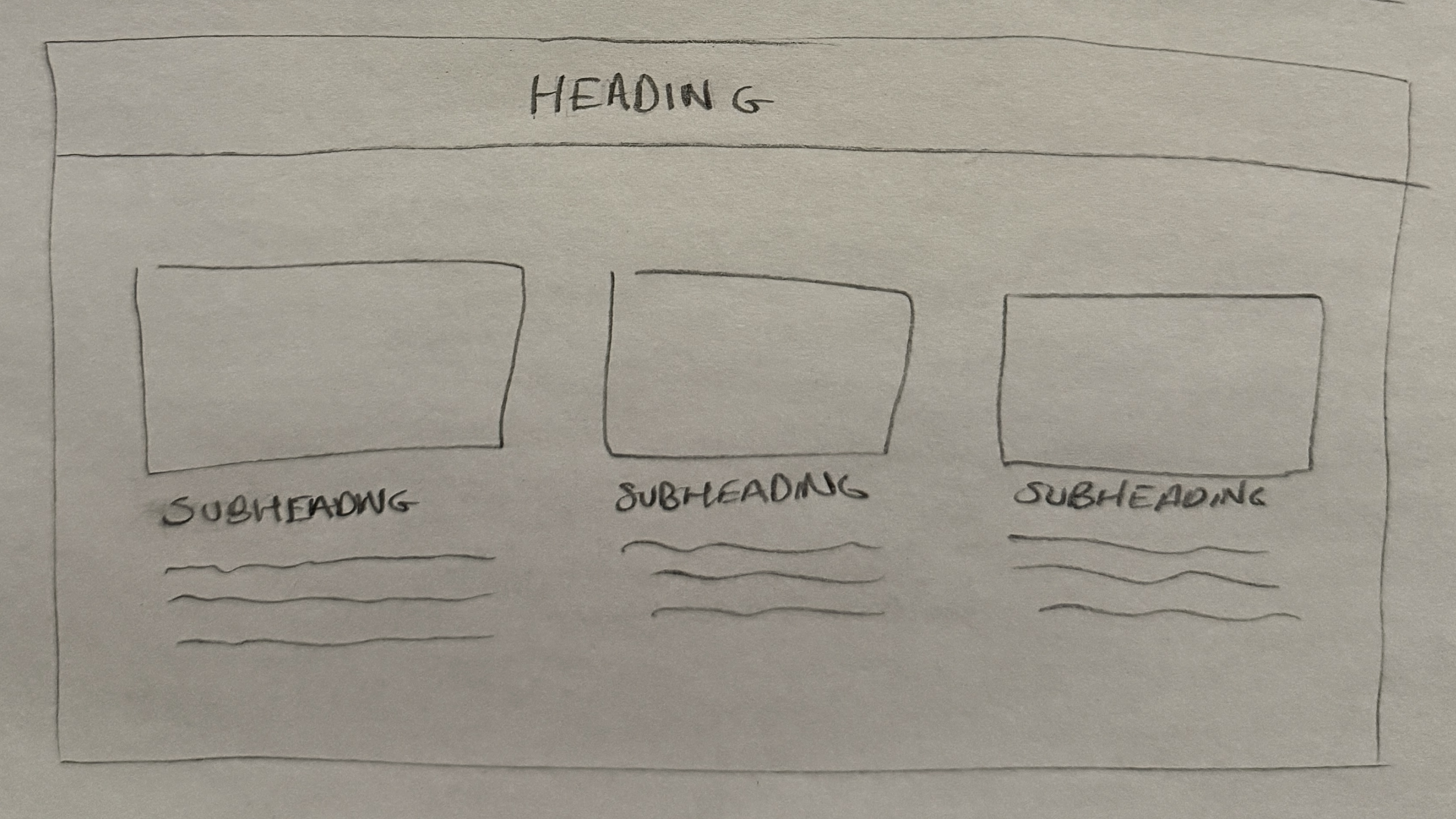
    • Created quick low-fidelity wireframes on paper to explore layouts and functionality. Focused on concisely conveying the business model for clients.

    Visual Design

      Branding
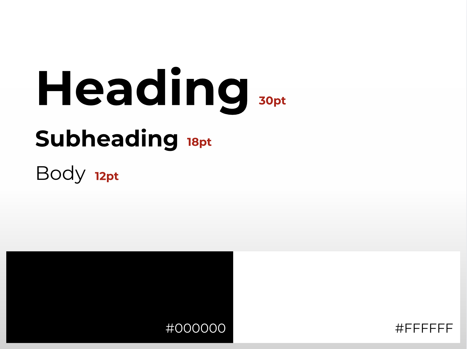
    • Incorporated the brand’s black and white color scheme to convey trust and professionalism.
    • Typography: Montserrat, sans-serif fonts for readability and modern aesthetic.
    • Responsive Design
    • Created designs optimized for mobile, tablet, and desktop views.

    Prototyping and Testing

        Usability Testing
      • Version 1
      • The initial layout included long paragraphs of text under each image, which caused readability issues. The design had to be adjusted to balance text and visuals, but this compromised design aesthetics.
      • Version 2
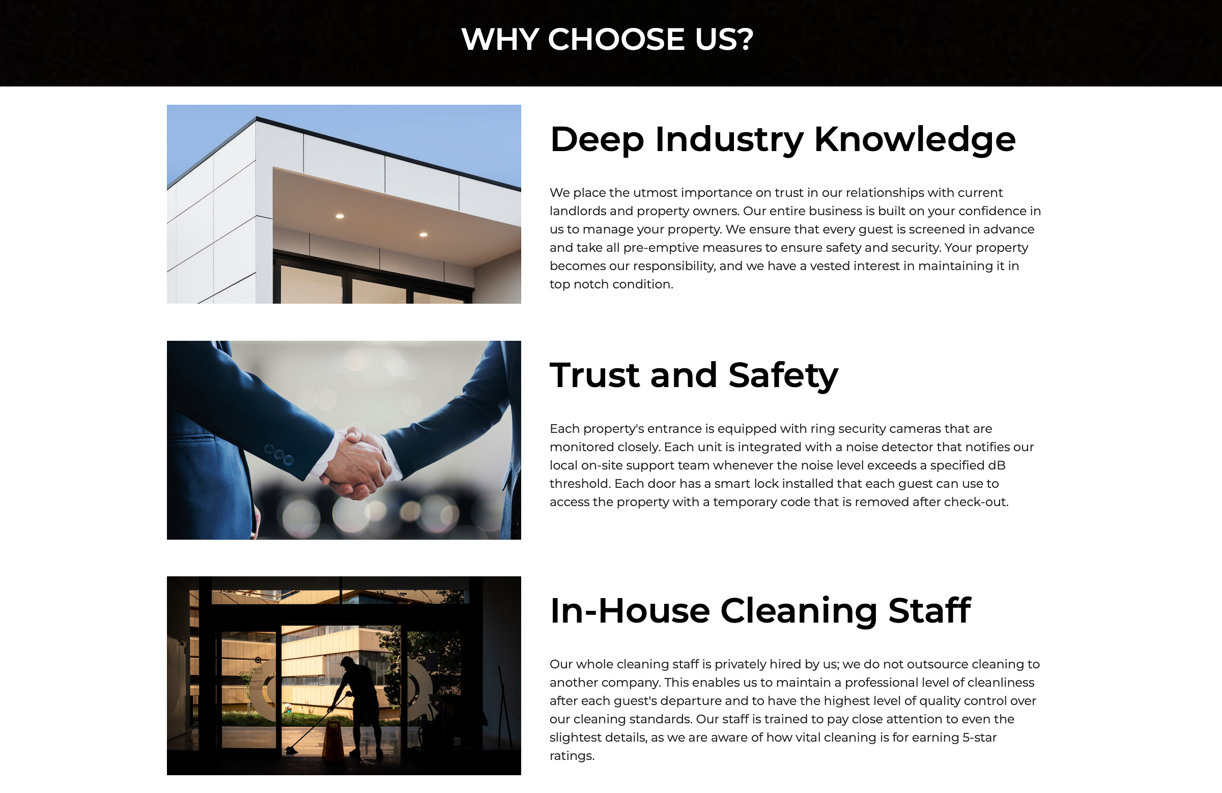
      • fter A/B testing, I shifted to a 3-row, 2-column layout to reduce text length under each image and maintain readability. This design aligned with natural left to right reading patterns, ensuring clarity and engagement.
    Visual Highlights

    1. Hero Page

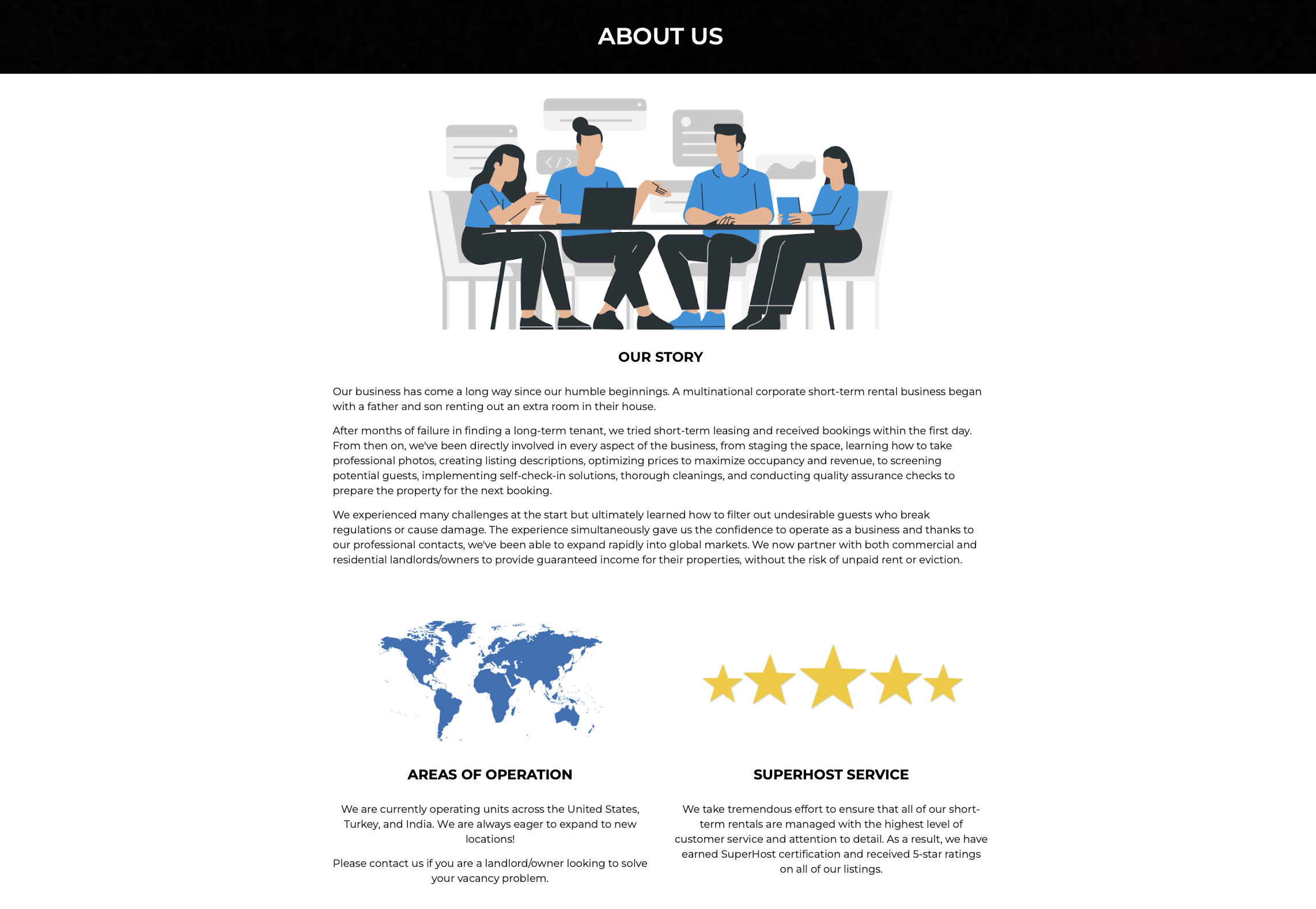
    About Us

    Backstory for potential business partners to learn about the founders

    2. About Us

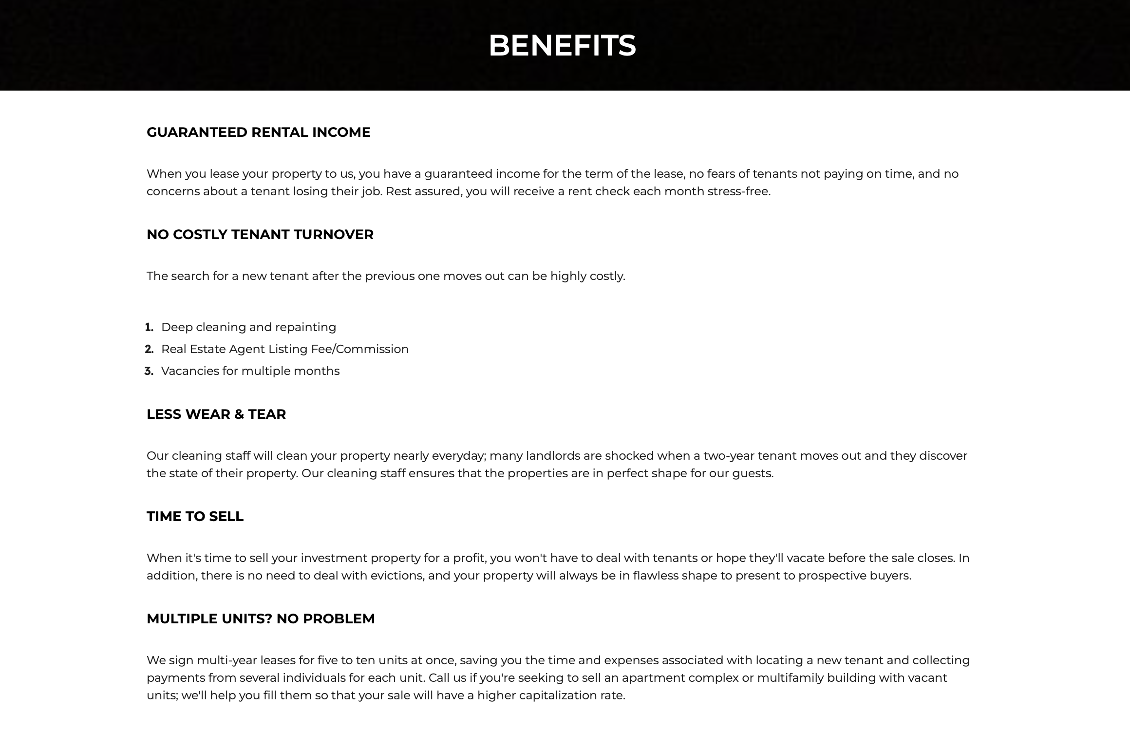
    Benefits

    Presenting the challenges that buildings face and how a partnership with Incestate would solve them

    3. Benefits

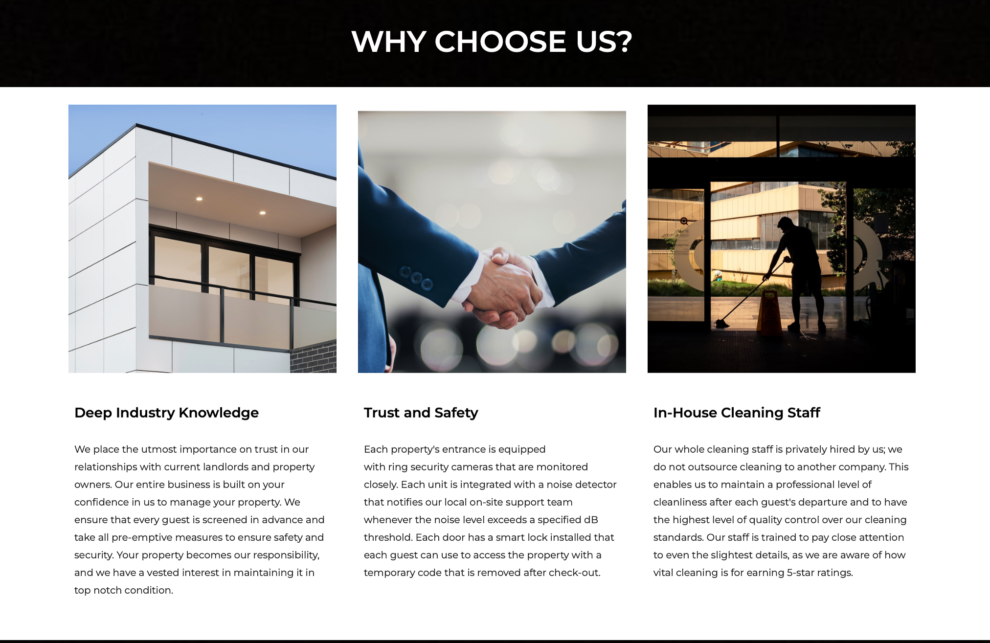
    Selling Points

    3 simple reasons why building owners should choose Investate over competitors

    4. Why Us

    Reflection

    • Challenges I faced: Managing conflicting stakeholder preferences while maintaining user focus.
    • What I learned: Balancing business goals with user needs requires iterative communication and validation.
    • Next Steps:
    • Explore advanced interactivity, such as virtual tours for properties.
    • Incorporate analytics tracking to further optimize the design post-launch.